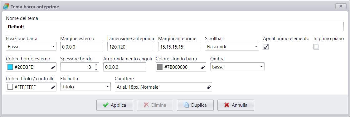
Preview Bar Theme

The preview bar can also be customised for each individual section, setting the following options:
Bar position
Sets the position of the bar on he screen. You can choose from:
- Right
- Bottom
- Left
Outer margin
Sets the outer margin that the preview bar should have on the screen.
Preview size
Sets the side of thumbnails.
Preview margin
Sets the margin of each thumbnail with respect to the container and to other thumbnails.
Scrollbar
- Show: shows the bar to scroll thumbnails if they exit the visual area.
- Hide: no bar is shown
Open the first element
The first preview bar element is opened automatically.
In the foreground
The preview bar stays over contents on the screen.
Outer margin colour
Sets the preview bar container margin colour.
Margin thickness
Sets the preview bar container margin thickness.
Corner rounding
Sets the preview bar container corner rounding. Expressed in pixels in this order: Top-Left, Top-Right, Bottom-right, Bottom-Left.
Bar background colour
Sets the preview bar background colour.
Shade
Sets the shade that the preview bar should have. You can choose from:
- None
- Low
- Medium
- High
Title /control colour
Sets the colour of the title, icon and thumbnail margin.
Label
Shows the label over each thumbnail. You can choose from:
- None: no label is shown.
- Title: the content title is shown.
- File name: the name of the file is shown.
Font
Sets the label font if Title or File Name are chosen.